Samuel Taylor Coleridge, The Rime of the Ancient Mariner , Essex House Press, 1903
19 June 2020
By Dr Cynthia Johnston, Institute of English Studies, School of Advanced Study, University of London

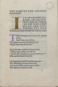
Samuel Taylor Coleridge, The Rime of the Ancient Mariner, (London: Essex House Press, 1903). On loan from Harris Museum, Art Gallery and Library.
The productions of the Essex House Press founded by the Arts and Crafts designer, architect and typographer, Charles Robert Ashbee, seem to perfectly embody the aims and the contradictions of the private press movement. Ashbee is perhaps best remembered as the founder of the Guild and School of Handicraft which he began in 1888. He was a multi-talented artist and artisan, whose buildings, jewellery and metalcraft works all reflected the aesthetics of Morris’ Arts and Crafts movement. Ashbee had met his hero, Morris, in person and in 1898 he managed to buy the Albion presses that Morris used at the Kelmscott Press after the closure of Kelmscott following Morris’ death in 1896. Ashbee created two typefaces for his press, the Endeavor in 1901 and Prayer Book in 1903, but he also used the 18th century typeface, Caslon, which you can see in the example we are looking at today. Although the absolute number of the books which were produced by the Essex House Press is something which is difficult to ascertain, as Ashbee sometimes reissued revised past publications and didn’t calculate these as new books, there seem to have been about 90 titles.

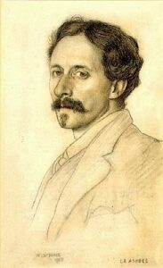
C. R. Ashbee by William Strang, 1903.
This edition of Coleridge’s Rime of the Ancient Mariner, is part of a collection called the Great Poems Series. It’s the tenth book in the series which Ashbee began to produce in 1900 which ran to 14 books. Every element of this book has been designed and executed with the utmost care. The woodcuts were made by Clemence Housman, following the drawings of the well-known artist William Strang. The gilt letter which opens the poem, and the further coloured initials, were created by the calligrapher Florence Kingsford. The typeface used is Caslon, and the entire book is printed on vellum, not paper. This was the pattern for each of the 14 books in this series. Every book also carried a blind stamped design of a flower and the motto ‘Soul is form’. There were 150 copies of this book produced by the Essex House Press.

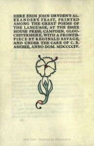
John Dryden, Alexander’s feast, 1697, (Essex House Press, 1904).
The irony of the Essex House publications, and those of other private presses, was that although the books were created in an atmosphere of communal respect for all the various makers of the books: the binders, gilders, printers, typographers and so on, the final product was an expensive item. Although the aims of the movement were to reconnect the working man and woman to their respective crafts, and to make the work they produced available to all, to enrich both private life and the public life of the community, few could afford to buy these works. The Great Poems series were priced between £1.10.00 and £2.25.00, which put them well out of the reach of most. The page reproduced here demonstrates the care with which each Essex House book was made. This is the final page to John Dryden’s Alexander’s Feast, part of the Great Poems Series; a perfectly balanced design created ‘under the care’ of C. R. Ashbee.