Sir Roger L’Estrange, Twenty-four fables of Aesop, Alcuin Press, 1928
22 June 2020
By Dr Cynthia Johnston, Institute of English Studies, School of Advanced Study, University of London.

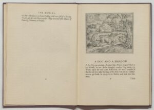
Twenty four Fables of Aesop and other eminent mythologists as rendered into English by Sir Roger L’Estrange, Kinght, with illustrations after the etchings of Marcus Gheeraerts the Elder, printed by Alcuin Press, Glos, (London: Ernest Benn, 1928). On loan from the Harris Museum, Art Gallery and Museum.
This is a fine example of the beautiful work produced by the Alcuin Press, a small private press that was in operation between 1928 and 1936. As is the case often in the establishment of these presses, its founder, Herbert Finberg (1900-1974), learned his trade at another private press, the Shakespeare Head. The Alcuin Press books were produced on hand -made paper using hand-set type in a workshop in Chipping Camden, Gloucestershire. This excerpt from the introduction to a pamphlet of examples of the various typefaces used by the Alcuin Press, written by Finberg, explores the decisions of the typographer as he choses the appropriate type for each work:
To the printer, who spends all his working life in their company, type-faces are as expressive as human physiognomy. His knowledge of their antecedents and daily habituation to their uses, teach him that there is a distinctive character behind every good typeface. He knows that the weight and colour of a type, the graduation of its curves, the formation of its serifs, the proportion of the stems to the body of its letters, are neither wholly fortuitous nor wholly determined by the conscious choice of their designer. Something of the designer’s own personality and of the world about him finds expression in these formal qualities….a given type-face is suited or unsuited for a given text, according as its character harmonizes or not with the literary character of the book.[1]
Some of the typefaces used by Alcuin were Garamond, Poliphus, Baskerville, Fournier and Eric Gill’s Perpetua. Unlike many private presses, Alcuin happily used these commercial typefaces but to great effect. The press also printed commercial, as well as art house, material.

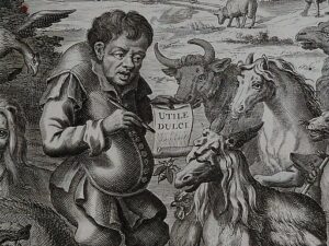
Part of frontispiece in 1692 folio edition of Roger L’Estrange’s Fables of Aesop and other eminent mythologists.
L’Estrange’s edition, Twenty-four fables of Aesop and other eminent Mythologists as rendered into English by Sir Roger L’Estrange, Knight, with ‘illustrations after the etchings of Marcus Gheeraerts the Elder’ was first published in 1692. Perhaps the most significant innovation of L’Estrange’s presentation of the chosen fables was the insertion of a moral after each fable, and a paragraph reflecting on that moral. This template for the presentation of fables continues today, particularly for those of Aesop. This edition includes some of our most familiar fables: ‘A Lion and a Mouse’, ‘A Dog and a Shadow’ and ‘A Wolf in a Sheep’s Skin’.
The Alcuin Press edition retains the charm of the original illustrations with the pleasing layout of twentieth-century poetry productions. The luxurious use of space does indeed invite the viewer to pause and contemplate both the tale and its moral.
[1] Herbert Finberg, The Choice of Type-faces in Book Production, (pamphlet), (Campden, Glos: Alcuin Press, c. 1930 (undated)).